NieR: Automata Mobile UI – Mobile game UI Mockup
UI Mockup
During my UI design class in my 3rd Year at Sheridan College’s Game Design program, we were tasked with re-designing a menu system from a popular game and making it accessible for mobile devices. The game that I chose to do this for was NieR: Automata, and I chose to re-design the shop menu.
When designing for mobile, it’s important to hone in on the most important functionalities, as mobile doesn’t leave room for wasted space. It also is important to make sure that all interactive elements are big so that a finger can touch them.
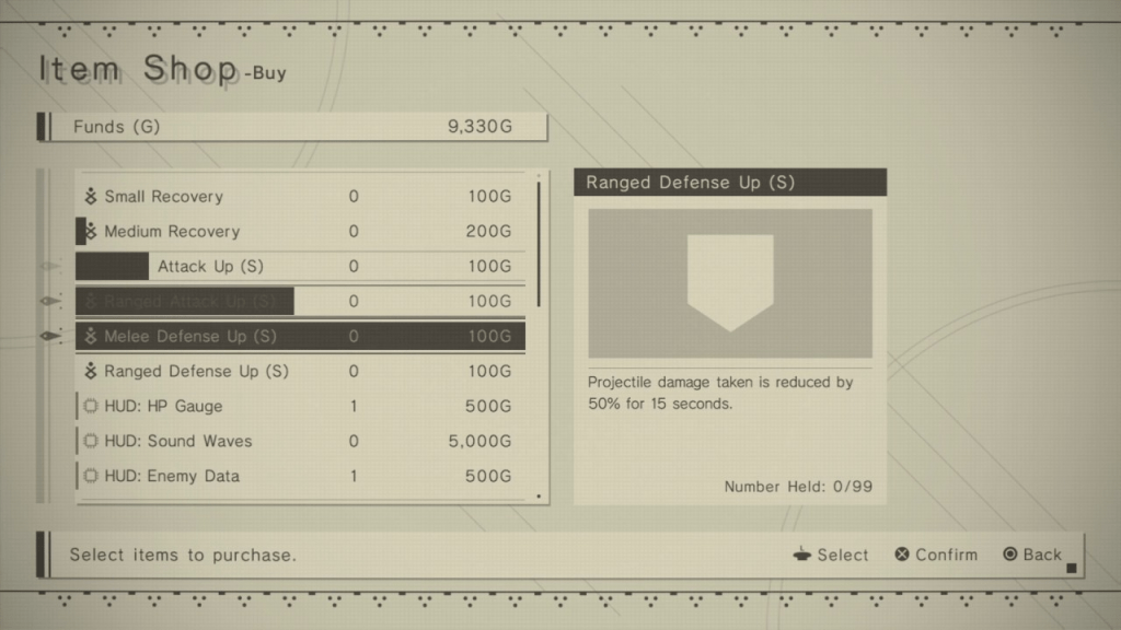
For comparison’s sake, to the left is a screenshot of the Item Shop screen in NieR: Automata. Below is what the mockup I created looks like:
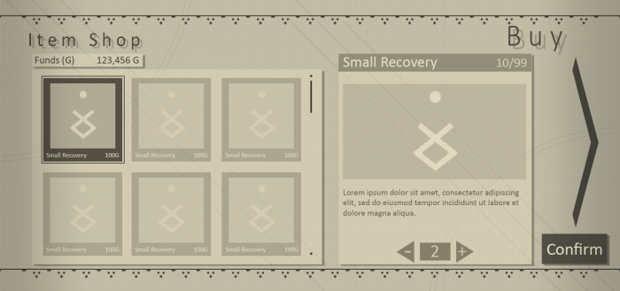

The results of the redesign can be seen here. I wanted to keep the same minimalist aesthetic as the original, but optimize its functionality for mobile. I eliminated the need for the player to select between “buy” and “sell”; instead, the player is taken to the “buy” screen upon talking to the vendor, and they can swipe left to be brought to the “sell” screen (or tap on the large arrow on the right side of the screen).
Rather than a long list of items the player scrolls through, items are presented to the player with large icons. This allows the player to more easily tap on the desired item. I’ve also integrated the quantity selection directly into the menu where you select the item you want. This reduces the amount of screens that the player needs to navigate from 4 to 2, which makes the whole process faster.
