Knight of Nights – Weapon Switching UX / Retro GUI
Design & Scripting
With this game, I was tasked with creating a User Interface that could fit into a game with a retro aesthetic. There were two major mechanics I needed to develop UI for: health, and switching between weapons.
Weapon Switching UX
At one point in development, the player was meant to gain new weapons as they progressed. As a result, there was a need to design how the player swaps between those weapons. I was inspired by games such as Bloodstained: Curse of the Moon while designing this, where players can change what character they are playing as on the fly. I wanted to have a similar system, where time freezes briefly and players can quickly swap between weapons. Unfortunately this system as cut due to time constraints (which is why the art style is completely different in this gif).

The player swaps between weapons with the left and right bumper (Q and E keys on keyboard). The weapon that the character is switching to is displayed above the player’s head, so that they know what weapon they have equipped. If the player reaches the “end” of their weapons, it will cycle back to the beginning with the sword. This is done so that weapon switching is extremely fluid for the player, as we did not want gameplay to slow down by forcing the player to pause the game and switch weapons a la Megaman.
Boss/ Player GUI
I also designed the game’s health bars for both bosses and for the player. We wanted something that was unobtrusive but easy to read, while maintaining the retro feel that Knight of Nights has. I also had to be sure to represent what weapon was currently active for the player, so they could know what weapon they were using at a glance. I went to work brainstorming simple and sleek HP bars for both a boss and the player.
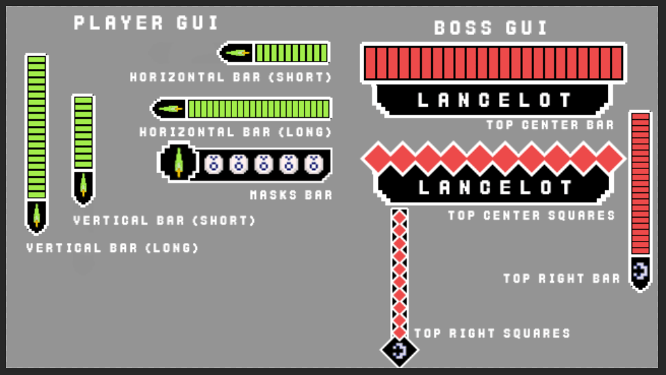
After brainstorming, I presented the results to my team, and we decided on what we liked the most for both the boss and the player.
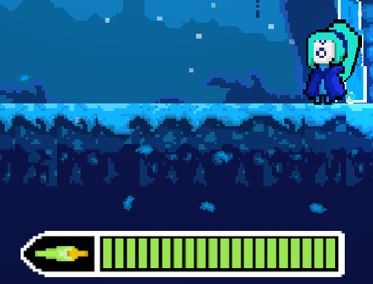
For the player, we went with the long horizontal bar since it was the easiest to read and the least obtrusive (not much happens in the bottom left corner of the screen).

When it came to the boss, however, we decided to go for a GUI that is big, top-center, and demands your attention. This makes it hard for the player to miss, and it means that it will be easy for them to quickly check how much HP the boss has left. It also helps the boss feel more imposing when you see how much bigger it’s health bar is.
