Colour the World
Mechanics Design
Colour the World is my 4th Year Capstone Project at Sheridan College. I took on many roles in this project, including designing our game’s major mechanics.
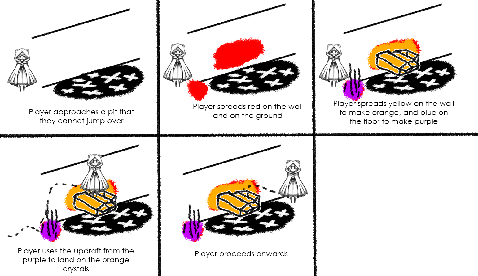
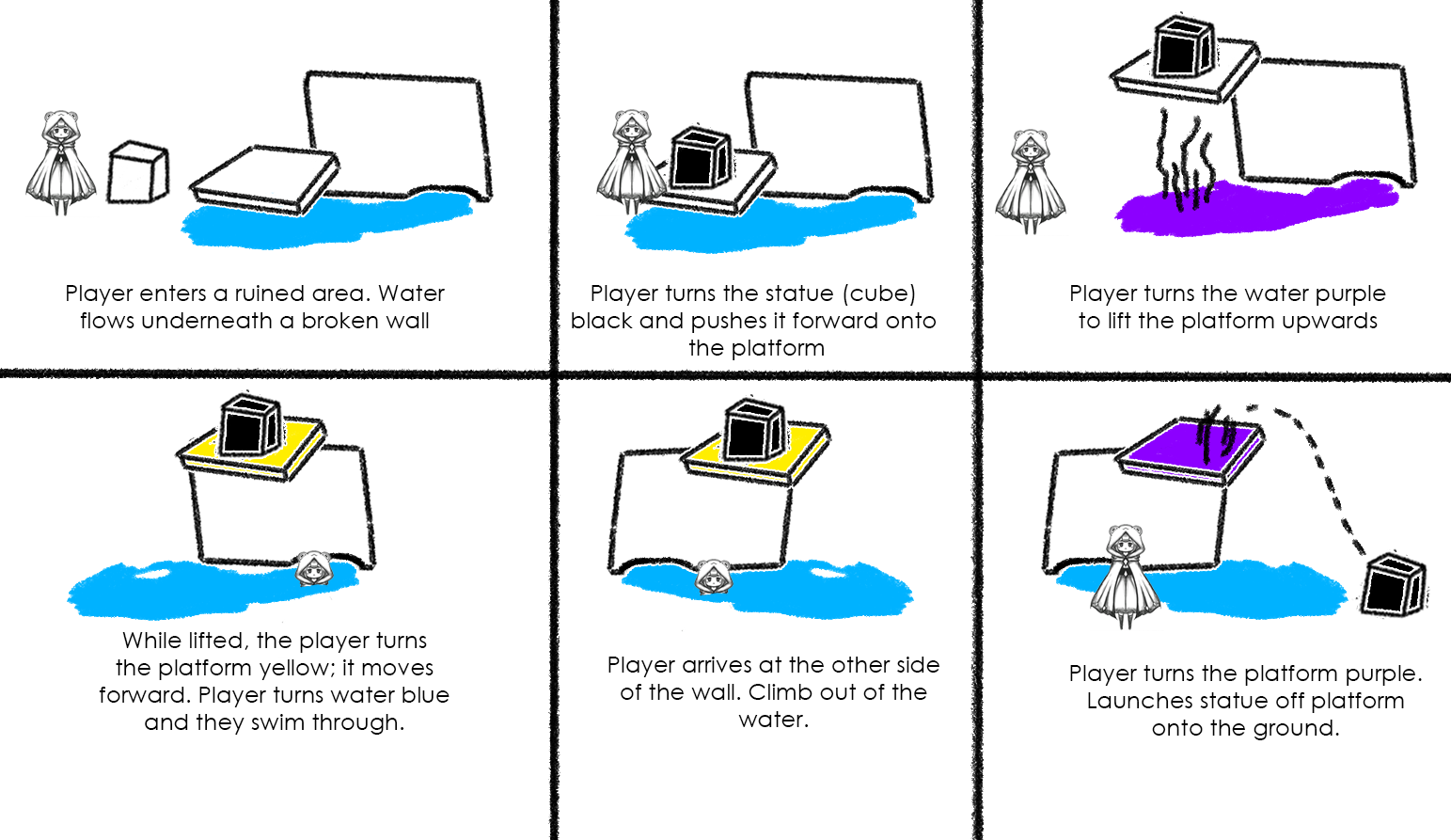
While brainstorming the game’s colour mechanics, I found it most effective for me to sketch out puzzle scenarios in a storyboard format so that I had a visual descriptor for each of our mechanics. These puzzles weren’t necessarily well developed, but they were good enough that someone could understand the mechanic at a glance. You can see a few of these below:

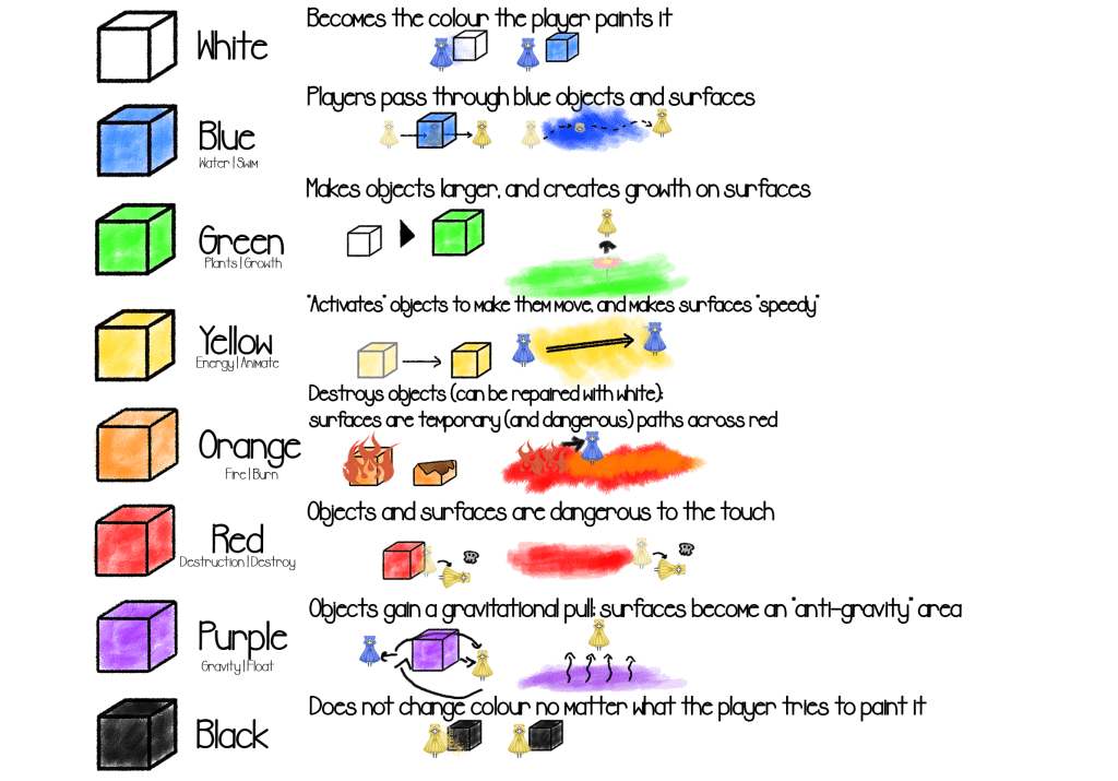
The design of our colours needed to be maintained as the project went on – as our scope and design goals changed, so must change our major mechanics. Most of our colours went through multiple iterations before eventually arriving at their final stage. We had to constantly iterate on our colour mechanics to make sure that they were both engaging and accurately reflected our design intent. Below, you’ll be able to see a diagram that was created to reflect what each colour did at the beginning of the project, and on the right you’ll see what each colour does closer to the end of the project.
Unfortunately, the colours Red, Orange and Purple were cut from the final game due to time constraints and were never properly implemented.

The Final Product
Here’s a video that showcases some of the gameplay found in Colour the World!
If you’re interested in seeing how the game turned out for yourself, grab a friend and try it out! I recommend playing the game with a controller: https://fallen-toast.itch.io/colour-the-world-demo
Postmortem – Designing Colours
I worked together with our game design lead Mya to decide on how our game’s main mechanics would manifest. We knew we wanted to have a game that revolved around colour, but there was some discrepancy with the team whether it should be using paint-based colour or light-based colour. In the end, we chose to have our game utilize paint-based colour as we felt the affordances this granted us felt more tactile and more relatable to a broader audience. We also felt that this afforded us an extremely interesting mechanic with colour mixing, so we wanted to pursue this route.
Originally, our game was going to allow players to freely switch between the 3 different primary colours. However, I was able to identify and convey to the team a few fundamental problems with this. Mainly, giving each player the same toolkit would discourage co-operation between players, making the game feel less like a true co-op experience. It was my suggestion to make a major design pivot to only give players access to 1 of the 3 primary colours each, a change that ended up being a cornerstone of our game’s puzzle and level design.
The team did have a major concern with the distribution of these colours, however. After all, there are 3 primary colours, but we were only designing for 2 players. Since this design problem sprouted from my suggestion, I took on the responsibility of solving it. We already decided we wanted 1 player to control Yellow and the other to control Blue, that left Red as the outlier. At first, the question was “How do I make Red fit in?” but after some deliberation and no success, I decided to approach the Red problem from a different angle:
Rather than force Red to fit in, embrace the differences that Red offers.
I embraced what makes Red, Red. Rather than make Red a force that would help players like all the other colours so far, Red should embrace the Danger that many people associate with it. It would be a colour that acted as an obstacle that players would need to avoid and work around – but also, thanks to our mixing mechanics, it could be a mechanic that players could use to their advantage given the right circumstances. This concept resonated with the team very strongly, and we chose to embrace this new approach to Red.
This did mean re-designing Purple and Orange as well. I wanted to create a balance with these two colours – since they were created by mixing a “safe” colour with Red – a “dangerous” colour – these mixtures should result in an effect that can be helpful or harmful to the player depending on the circumstance. Orange’s new effect was based on “hot coals” – when a player steps on an orange surface, they run forward at a high speed and can’t stop until they’re off the Orange surface. Objects that were turned orange would be burned down and destroyed. Purple’s effect was “Gravity” which would allow players to float upwards off the ground… but they had to be careful, as if they floated upwards for too long, then they could float too far off the screen and die. Objects also had a gravitational pull when turned purple, which I created a Unity sketch of to convey properly to the team.
Unfortunately, we ended up needing to cut Red, Purple and Orange from the project due to time constraints. I agreed that this is what was best for both the game and for the team, so I put up little resistance when this was cut. It’s always important to be in-touch with scope and not get too attached to your own ideas, no matter how much you believe in them.
